Docs / Guide
How to read a footprint chart
A footprint chart — also called a cluster chart — shows bid and ask volume at every price inside a bar. What the two numbers mean, how imbalances are marked, and what to check first.
Updated
A candle is a summary
A candle tells you where a period opened, traded and closed. It does not show how much buying and selling happened at the prices between those points. A footprint chart — also called a cluster chart, or footprint candles — keeps that auction visible: each row is a price, and the values in that row show the market-order volume that traded there.
What one cell shows
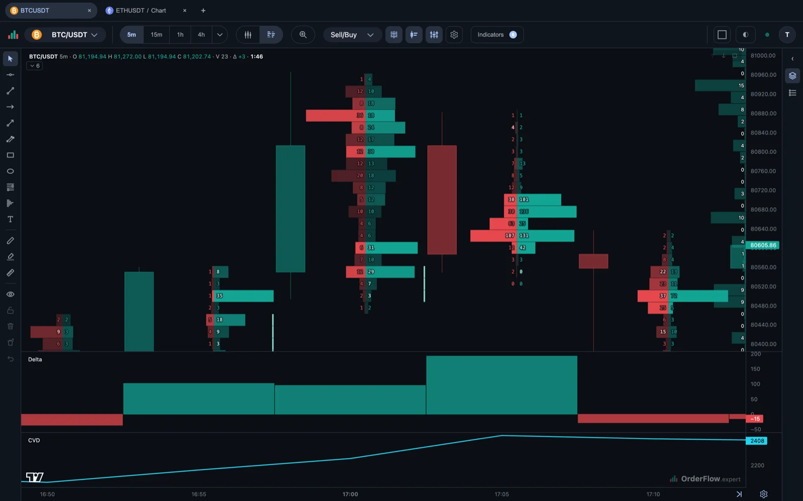
Each cell belongs to one price level. The two values are sell volume at the bid and buy volume at the ask. A market order to buy crosses the spread and lifts the ask; a market order to sell crosses it and hits the bid. The footprint groups trades by that taker side, so it describes market orders rather than every limit order waiting in the book.
Cluster modes
Sell/Buy is the default: every cell prints the sell volume at the bid beside the buy volume at the ask. Delta replaces that pair with the difference between them, so one glance shows which side was sending market orders. Volume shows the total that traded at each price, which is the fastest way to find where the auction was most active. Change the mode to answer one question at a time; no mode is a complete trade signal on its own.
In every mode a cell’s opacity tracks the size of its delta: the further one side ran ahead of the other, the more solid the cell. The Intensity setting in the footprint settings is where that threshold lives — the delta at which a cell reaches full opacity.
Imbalances
An imbalance is a lopsided price level: within one cell, one side traded at least three times the volume of the other. The footprint marks it by printing that side’s number in bold, so a price where market buying overwhelmed market selling stands out without any extra chrome on the chart.
Because the mark is the number itself, imbalances are visible only while the cluster labels are drawn. Zoom out far enough that the cells stop printing numbers and the highlighting goes with them — zoom back in to read the level.
What to look for first
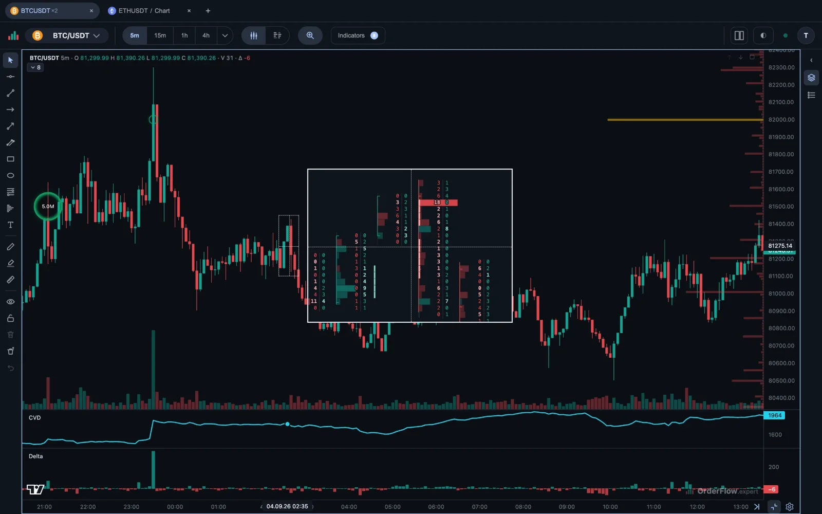
Start with the bar in context. Repeated selling into one price while price stops falling can suggest absorption: a buyer with limit orders is filling all of it and not stepping away. A thin tail near an extreme is the opposite case, exhaustion — the side that was pushing simply ran out of participants. Several same-direction imbalances stacked through a move can show market orders that kept coming, and the Stacked Imbalance indicator keeps them on the chart as zones. None of these patterns is a reason to act on its own. It becomes one at a level that already matters, once price and the next bars agree; the four common setups show how traders put them together.
Common mistakes
Do not read one bright cell in isolation. Compare it with the rest of the bar, the recent range and the higher timeframe. Volume means activity, not direction: a large number can be buyers meeting sellers at exactly the same level. Finally, remember that a footprint describes completed trades; use the live order book and the Liquidity Heatmap separately to study the limit orders waiting there.